Human services professional turned
UX/UI Designer and Researcher
UX/UI Designer and UX Researcher

The home decor e-commerce site that helps customers visualize inspired interior designs.

Synopsis
The Problem
People moving into a new apartment or home tend to have furniture, but are looking for details to personalize their space and make it feel like home. Some people don’t feel confident picking out products on their own to create the look they’re going for.
The Solution
House2Home is an e-commerce website that sees an opportunity to help people find a starter kit of home decor that instantly converts a customer’s space into their own home. The website site is introducing a new feature that allows users to filter and browse curated looks and see if the decor from those looks work in their own space.
My Role
User Experience (UX) Designer
User Interface (UI) Designer
Key Skills
Working in an agile environment, ideating, sketching, creating a storyboard, creating a prototype, usability testing.
Timeline
6 days
Tools


Interactive Prototype
Situation
You just moved in to a new place. You have basic furniture like a couch and a coffee table, but you’d like to buy some home decor to make your space feel like home. You have an idea of how you’d like your place to feel, but you’re not sure which pieces would make it feel like you want.
Go ahead, check it out!
Solution Overview: Primary Features
Visualizing Space
After choosing a curated look, customers can see how those home decor items will look in their own space.
Curated Looks
Customers can browse curated looks so they don’t need to worry about what items to buy in order to create a stylish, cohesive look.

Process
Modified Design Sprint
First, I mapped out the problem to fully understand it. I took the discovery research that was provided and made an affinity map. From there, I was able to define three main problems. With those problems in mind, I quickly mapped out the steps a user would take in order to solve these problems.
Second, I started thinking of solutions. In order to do this, I conducted Lightning Demos where I looked at great solutions and experiences that other companies have pursued. Incorporating some of those ideas from the Lightning Demos, I sketched options for the most critical screens using the exercise, Crazy 8s. Finally, I chose the idea I liked the best and sketched out the screen that would come before and the screen that would come after.
Third, a team would normally decide which solution to go with. However, because I was working as a solo designer, I jumped ahead and created a storyboard of the user’s journey. Fourth, I designed a prototype and fifth, I had five users participate in usability testing.
-
Affinity Map
-
How Might We Questions
a
-
Lightning Demos
-
Crazy 8s
-
Storyboard
-
Prototype
-
Usability Testing

Map
Discovery research had already been completed. I was presented quotes from 10 users, a short interview with one user and a persona in order to start the sprint.
Affinity Map
I used the website, Miro, to create a quick affinity map in order to determine common themes.

Common Themes
What to buy
How they'll look
Budget
How many to buy
“I find lots of cool little items that I like, but I never know if they’ll all look good together in the same room until I buy them.”
“So many items look great in the staged photos - but will they look good in MY living room?”
"How can I get the look I want within my budget?"
"How can I get the look I want within my budget?"
Problem Statements
With these common themes in mind, I was able to define the problem space.
How might we...
1
2
3
...help users choose home decor to match their style?
...help users visualize home decor products in their space?
...help users maximize impact while staying on budget?
Map out Steps
With the above “How Might We” questions in mind, I mapped out the steps a user would take in order to solve these problems.

Sketch
Lightning Demos
Through lightning demos I got inspired by solutions and experiences that other companies have pursued. I looked inside and outside of the online home decor industry to discover best practices and standards.

Joss and Main’s online catalog contains beautiful photos with interactive elements. When the user hovers over the circle with a “+”, a label appears. When the user clicks the element, it offers a different photo, a call to action and descriptive text. Improvements I would make would to offer a price in both the hover and the clicked states and also to make the hover label more aesthetically pleasing.

Airbnb's filter is effective because has a multitude of options that are adjustable in just two clicks. It diminishes the friction when a user wants to sort through many options. However, if the user desires more choices, there is a filter button at the end which presents additional attributes.

Ikea’s interactive “design your home” experience is delightful. They offer their products on the left which you can click and then it drops into the photo on the right. When users hover on the photo, it offers different options of what you could do to the product, like rotate, add to cart, delete or see more information.
Joss and Main’s online catalog contains beautiful photos with interactive elements. When the user hovers over the circle with a “+”, a label appears. When the user clicks the element, it offers a different photo, a call to action and descriptive text. Improvements I would make would to offer a price in both the hover and the clicked states and also to make the hover label more aesthetically pleasing.
Crazy 8s
Next, I set off to iterate ideas of the most important screen using the Crazy 8s exercise. The most important screen is the one that allows users to try out items from a home decor kit to appear in their space, which is a photo they uploaded. This is a complex screen that is essential in helping the user complete the problem statements, “How might we help users visualize home decor products in their space?” and “How might we help users choose home decor to match their style?”

Solution Sketch
In the Crazy8s exercise, I chose the idea in square three because it's important to have photos of the home decor be large enough for the user to get a good view. Also, it's the one that could remain clean (not cluttered) and delight the user with interaction.
Below is a three-screen flow. The critical screen is in the middle. The screen on top comes immediately before and the screen on the bottom comes immediately after.

Sketch
Storyboard
I fleshed out the solution sketch to make a storyboard starting with the home screen and ending with the confirmation that the customer added item(s) to the card. First, the customer could take a quiz (screens 2-4) to determine their style, which would then be reflected in the filter of the curated looks (screen 5).
Once the user chooses which look they like best, the critical screen would appear. The user has three three options:
-
They can select decor piece by piece. As the user selects the decor, it will appear in the image of the room (screen 6).
-
The user can select their budget and the website will recommend which pieces to buy that will have the maximum impact on their space (screen 7).
-
The user can select the full look which includes all of the products shown for the look the user chose (screen 8).
Once the user chooses which piece(s) they would like, an “add to card” confirmation would appear with the option to checkout (screen 9).

Prototype
When creating a prototype, I made a couple of important changes from my storyboard to ensure better usability:
-
In screen 6, in order to make enough space for the photos of the home decor and photo of the user’s room, I moved the running total of the selected items to the space below the photo.
-
I kept the photo of the user’s space in the same place in screens 6-8.
-
I added a screen so that the user could find out more information about the product.


Usability Testing
In order to discover usability issues, I recruited 5 people to participate in moderated usability testing. All five people had ordered home decor or furniture online. Four were conducted remotely and one was in-person. The primary goal of the usability testing was to determine the barriers people encounter when using the website.
During usability testing, I gave participants the carefully worded situations to encourage them to complete the tasks of buying home decor from the curated kits where the user would select home decor to buy:
-
piece by piece
-
by budget
-
to get the full look
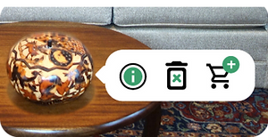
Problem: Confusing Icons
Context
When a customer is using the room visualization tool and the user hovers over a dot or a piece of home decor, three icons appear.
Problem
Some users had trouble determining what the trash can meant.
Solution
I would add a hover state to the icons so that labels appear when the user hovers over the icon.
Before
After


Problem: Feature not being utilized
Context
In the room visualization tool, when a user hovers over an item, an icon appears allowing users to add that item to their cart. There is also a button that allows users to select products, then add all of the products to their cart at once, which would be quicker.
Problem
Some users aren’t utilizing the button to add multiple products to their cart at once. Instead, they are adding products one by one by hovering over each item.
Solution
I would try adding an icon onto the “add to cart” button. It’s also possible that the button was too big that users didn’t perceive it as a button. I would also try making the button smaller.
Before
After


Problem: Drag expected instead of click
Context
In the “budget” section of the room visualization tool, there is a bar with several different budgets to signify the price for each kit. When the user clicks a dollar amount, the bar reacts either shrinking or growing.
Problem
Some user’s first instinct was to click and drag the selected part of the bar.
Solution
Make the interactive feature a sliding scale where the user could either click the number or click and drag the selected part of the bar.
Before

Some users want to click and drag to slide the scale
After
Users will be able to click and drag or click a number to move the scale. Both options will be available.
Conclusion
Next Steps
Improve through iteration
As described above, I would:
-
using the home visualization tool, add hover states to icons so users know exactly what to expect when they click.
-
improve the “add to cart” button by making it smaller and adding a symbol.
-
in the “budget” section, make the sliding scale work by either dragging the selected part or clicking the number.
Problems designing alone
-
From early on, I wanted to discuss with software engineer to see what would be needed for this project to be technically feasible or even if this idea is technically possible. It's possible that this idea would be better suited on a phone or a tablet.
-
This process is really effective when executed as a team. Having different, diverse ideas throughout the process would make the end product stronger.
Tight timetable
Had I more time, I would:
-
prototype all possible combinations of home decor in the “Individual Piece” section of the home visualization tool so users would have a more immersive experience. Right now, users can only select up to two items.
-
improve the home visualization tool by adding the option to drag home decor items to where the user wanted them to go. This would further personalize the user’s experience.
-
add more entry points to the page with curated looks that users can filter. Without taking the quiz, users could access curated looks through the menu or by clicking on “Featured Looks” from the homepage.