Human services professional turned
UX/UI Designer and Researcher
UX/UI Designer and UX Researcher
Sprout to Sage
Connecting gardeners of all levels to inspire,
exchange with, and learn from one another.

Synopsis
The Problem
Gardening has greatly increased in popularity since the Covid-19 pandemic started, as well as awareness of how important social connections are. In spite of the technology and resources that are available, gardeners do not have an accessible, centralized online gardening community with the information they need if they have gardening questions, if they are looking for inspiration or if they would like to exchange products from their garden.
The Solution
Sprout to Sage is an app that connects gardeners of all levels to inspire, exchange with, and learn from one another. People are empowered to live healthy, meaningful lives when community members of all ages and abilities are connected and have the opportunity to use their skills and talents. Sprout to Sage is a trusted resource for collective gardening wisdom, inspiration and trade while encouraging users to be curious, create beauty and contribute to their community.
Interactive Prototype
Go ahead, check it out!
Solution Overview: Primary Features
Inspiration
Gardeners can get ideas for their next project or for next year’s garden by viewing and saving photos of other people’s gardens. They can also post photos of their own gardens to inspire others.
Exchange
Gardeners can view listings or offer up products from their own garden to trade, give away or sell/buy.
Resources: Community
Gardeners can get ideas for their next project or for next year’s garden by viewing and saving photos of other people’s gardens. They can also post photos of their own gardens to inspire others.
Resources: Library
Gardeners can find articles about gardening strategies and look up specific plants.
My Role
User Experience (UX) Designer
User Interface (UI) Designer
Key Skills
User research, ideating, sketching, low-fidelity and high-fidelity prototypes, usability testing.
Timeline
August - November 2021
Tools


Process
Design Thinking
I employed Design Thinking throughout the process of crafting Sprout to Sage. First, in order to empathize with users, I conducted secondary and primary research, understanding users’ challenges and motivations for gardening. Next, I defined the problem space, based on the synthesis and analysis of data from the discovery research.
After, I explored different solutions that may help gardeners with the challenges they face. Then I made low fidelity prototype, sketching out some of my ideas and testing them on users. Based on the feedback I received, I made low-fidelity wireframes followed by a high fidelity prototype and conducted two rounds of usability testing.
This is far from a linear process. For example, in every step, I strived to empathize with users, seeing value, delight and usability from their points of view. Also, after I was done testing, I needed to ideate to solve usability problems that I discovered.
.png)
Secondary Research
First I conducted secondary research to attain a baseline understanding of 1) the gardening industry 2) who gardens 3) challenges to gardening. Below are the highlights of my findings. See sources in the footnotes at the end of this case study.
Gardening Industry
Worldwide, the gardening industry was valued at
$104 billion
in 2020 and is projected to keep growing.
In the U.S., in 2021,
86%
of homeowners planned to continue gardening.
47%
of whom planned to plant more in 2021.
Who Gardens
About
50%
of gardeners are women
About
50%
are older adults
Challenges
There are many factors to consider for plants to thrive

Empathize
Primary Research
Identifying Participants
I crafted a screener survey and asked people who identified themselves as gardeners to take it. Ultimately, I got 37 responses.
Skilled Gardners

78%
have gardened for 5 or more years
Annual Plants

84%
typically plant annuals
(plants that last 1 year)
Perennial Plants

92%
typically plant perennials
(plants that last many years)
Plant Outside

62%
plant exclusively outside
Objectives
The principal goal of my primary research was to determine what challenges gardeners face when planning a garden. My research questions were as follows:
-
What is the end-to-end process gardeners use for planning their gardens, including what factors they consider when planning and how they choose their plants?
-
What are gardeners’ pain points when planning a garden? (What’s difficult? What are the obstacles? How do gardeners overcome those obstacles?)
-
Are there tools or resources gardeners use to plan their garden? (Could these tools be improved?)
-
What are gardeners’ motivations behind planning a garden?
Interviews
I interviewed 14 participants, 8 by phone, 3 by Zoom call and 3 in-person. After interviewing participants, I transcribed their interviews. Below is the first page of each transcription.

Synthesize Research
Affinity Map
After interviewing participants, I transcribed their interviews and put each thought on a separate post-it note. I then organized the post-it notes into common themes.

Common Themes
Learning from others
"I learned about blood meal from another gardener in the community garden last year. You're constantly learning."
Inspiration
"That's why I like talking with [my neighbor] because he has beautifully shaped apple trees."
Maintenance when out of town
"I go away periodically so I have to figure out how my garden is going to get watered."
Too much produce
"Even though I've had enough beans, there are still more beans that need to be harvested and I have to figure out something to do with those beans."
Plan for growth
"When you buy your plants, they're so little. You can't picture them taking over, but they do!"
Empathy Map
While most gardeners I interviewed grew both perennial and annual plants, every gardener I interviewed had a primary interest as shown below. It was easy to divide participants into two groups.
.png)
By creating empathy maps for perennial gardeners and vegetable gardeners, I covered the vast majority of users. I crafted empathy maps to better understand users’ frustrations and motivations as gardeners. Based on my affinity maps and recalling different people I interviewed, I also imagined what users would think, feel, see, say, do and hear.


Personas
For both user groups I crafted a persona that embodies the characteristics described in the empathy map. This way, it’s easier to empathize because I could think of a person instead of synthesized data.


Define
Key Insights from Research
I incorrectly assumed that gardeners had difficulty planning their garden. In fact, only one out of the fourteen gardeners expressed challenges with the supposed multitude of factors for which gardeners plan. Instead, below are the key insights gained by synthesizing and analyzing the data in the affinity maps, empathy maps and personas.
Importance of connections
Gardeners get advice by speaking with other gardeners.
Gardeners in community gardens see and get inspiration from gardens around them.
Maintenance when out of town
Plants need watering and vegetables have a small window to harvest.
Too much produce
Food goes bad before it's eaten and/or food stays on the plant too long, rendering it inedible.
Growing from seed is laborious, but has advantages
Gardeners who grow from seed:
-
Very few users primarily use seeds
-
There's a vast selection of seeds
-
Seed growers often end up with too many seedlings.
Planning for growth
When you get seedlings they are so small. It's hard to imagine them growing large. When plants are too close, they compete for water and nutrition and are more likely to get a disease.
Problem Statements
With these insights in mind, I was able to define the problem space by creating "How Might We" questions.
How might we...
1
help gardeners connect to one another and see other gardens?
2
help gardeners maintain gardens while they're out of town?
3
help gardeners reduce food waste?
4
broaden the seedling options for gardeners?
5
help gardeners adequately space their plants?
Ideate
Once I defined my problem statements, I began to brainstorm solutions. In the end, I cam up with over 75 ideas. In order to start thinking about and analyzing these ideas, I created an affinity map.

I narrowed these down to four ideas and fleshed them out.


Ultimately, I chose “Online Message Board” and “Inspiration Gallery of Gardens” because they provided the most value to the most gardeners.
User Journeys
Next, I created multiple user journeys to articulate what specific roles a user may inhabit and to keep the user at the center of the design process. I then prioritized them to determine the minimum viable product (MVP). The user journeys below represent the MVP.
As a gardener,
I want to...
receive and offer advice
see other gardens
be able to sell, give away or exchange extra produce, seedlings or plant splittings
get in-person help for my garden when I go out of town
so that...
I can be part of a gardening community
I can get ideas and inspiration for my
own garden
I can minimize food waste while giving people access to locally grown food.
my garden remains healthy while I’m away
App Section
Advice
Inspiration
Market
Market
Click here to see all of the user stories, containing the ones not included in the MVP.
Site Map
I created a hierarchical diagram that represents screens of the app that show how the screens are connected.

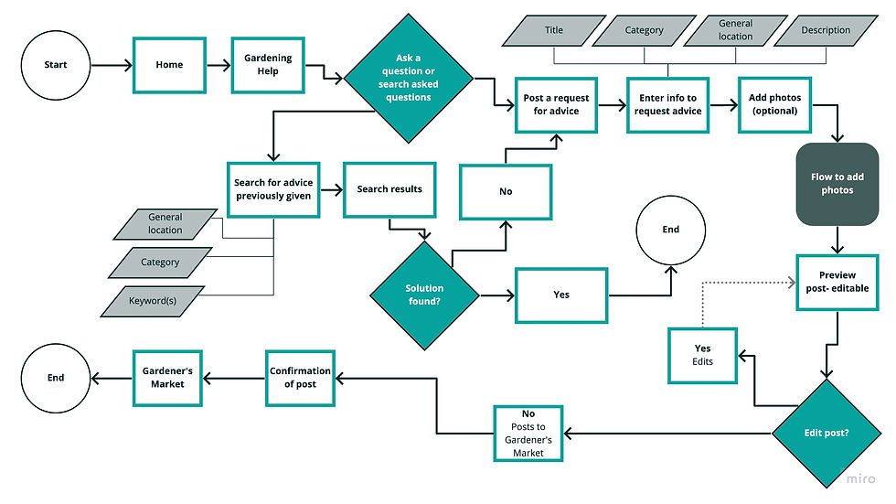
User Flows
Based on the user stories of the minimum viable product (MVP) and the site map, I assembled user flow diagrams to show how a user would complete their journey. Below is the key and then two of the five user flow diagrams.
.jpg)
Flow 1: Gardener asks for advice
.jpg)
Flow 2: Gardener posts a listing to the market

Competitor Analysis
Sprout to Sage has a market, a place to ask for and give advice and a place to look at photos for inspiration or ideas. For my heuristic analysis, I evaluated three apps: Facebook for its marketplace, NextDoor for its message board and its marketplace, and Houzz for the ability to discover and save ideas. I found that each app had strengths and ways in which they could improve.

Prototype and Testing
Sketches
Using the user flows as a guide, I sketched out corresponding screens. Below are just two of the six flows.
Flow 1: Gardener asks for advice
Frames

Video
Flow 2: Gardener posts a listing to the market
Frames

Video
Evolution after Usability Testing
Next, I tested out my sketches with five gardeners to find usability issues. I’ll highlight two problems were unearthed. Below, you’ll see the sketch with the problem and then the revision of the problem in a wireframe.
Problem: Small, single post button
Context
There are several situations where users would want to post to the app.
Problem
There was a single post button located in the navigation bar. However, many users were either confused by the button or couldn’t find it.
Solution
I made the post buttons the primary action in each individual section. That way, the button was easier to find and the text could be customized to more accurately describe what the user was posting.
Before

Small, vague "post" button
After

"Post" button is more prominent and the label is more specific
Problem: Strangers going to user's home
Context
In my sketches, the app encouraged users to trade their goods for garden services (i.e. 30 minutes of weeding).
Problem
Most users were very uncomfortable with strangers coming to their home, especially if they weren’t there.
Solution
The wireframes didn’t encourage users to trade services.
I simplified the trading process by connecting the two parties by private messages.
This was a complicated system to trade and may discourage trading.
When a user wanted to trade, the app asked what would the user like in return.
Before

After

Users uncomfortable with choices; complicated trading system
Simplified trading system
Low Fidelity Wireframes
I took the insights I got from usability testing to create wireframes. Below are just two of the six flows.
Flow 1: Gardener asks for advice

Flow 2: Gardener posts a listing to the market

Design System
In order to create a consistent visual identity to represent the brand, I created a design system.


High Fidelity Prototype
With the design system and the wireframes, I generated high-fidelity designs. I then connected the UI elements and frames to have a interactive high-fidelity prototype I could test.
Flow 1: Gardener asks for advice
Frames

Video
Flow 2: Gardener posts a listing to the market
Frames

Video
Usability Testing
In order to discover usability issues, I recruited 10 people to participate in two rounds of moderated usability testing (5 participants each round). Nine were conducted remotely and one was in-person. Eight gardeners I had recruited from my discovery research and two were new participants. The ten participants represented a full spectrum of gardening ability and a full spectrum of comfort using mobile apps. The primary goal of the usability testing was to determine the barriers users encounter when using the app.
During usability testing, I gave participants carefully worded situations to encourage them to complete the following tasks:
-
Post a listing in the market.
-
Buy something from the market.
-
Find and save inspiring ideas.
-
Share a photo in the ideas tab.
-
Find specific gardening advice.
-
Give gardening advice.
Round 1 User Testing: Result Highlights
Problem: Navigation Issue #1
Context
When navigating the app, some users got lost, not knowing where to go, particularly when they were asked to get rid of extra vegetables.
Problems
-
If they went to the market, they had a hard time finding the “post” button.
-
Some users didn’t understand that the photos are listings.
-
Some users went to the advice section instead of the market.
Solutions
1. I added a clearer heading and added labels to each photo.
2. I increased the size of the “post” button.
3. I changed the labels on the navigation bar.
“Market” became “Exchange” and “Advice” became “Resources”
4. I added a tour of the app. Users click through to understand its features.
Before

-
Clarifying header and labels under post button
-
Bigger post button
-
Better language in the navigation bar
-
Walk-through tour
After

4. Tour

Problem: Navigation Issue #2
Context
When users were given a situation where they needed to access the library in the advice section, some had difficulty finding the library.
Problems
People weren’t seeing the secondary navigation bar.
Solutions
I enlarged the font and extended the bar below the text to change its place in the visual hierarchy of the screen.
Before

Changed the secondary navigation bar
After

Round 2 User Testing: Result Highlights
Problem: Users expect links
Context
When going to the “Exchange” section for the first time, users encounter a key explaining what the symbols mean.
Problems
When users encountered the key, almost everyone clicked the “trade, give or sell” expecting to be able to post.
Solutions
I added links to the key so the app reacts how users expect.
Before

Didn’t react when users tapped “Trade,” “Give” or “Sell”
After

Problem: Confusing Transition
Context
When a user posts to give away produce, they have the option to find close food shelves to encourage users to donate to those in need.
Problems
The primary action led them to finish the post they had begun, which caused confusion. When users found the food shelf, they wanted to go back to the main exchange screen.
Solutions
I changed the primary action to go back to the exchange. The secondary action button was to finish the post.
Before

Changed the primary and secondary actions
After

Final Prototype
Learnings
Be Mindful of Assumptions
I realized fairly early on that I had incorrectly assumed that gardeners faced challenges when planning their garden. However, it quickly became apparent that, while gardeners do face challenges, planning was not one of them. In the future, I will be on the lookout for my own beliefs, biases or expectations, even if I can’t immediately name them.
Test Early and Often
I originally thought testing sketches was a bit early in the process to start user testing. Even though it wasn’t a polished representation, users gave really valuable feedback that prevented major issues later in the process.
Balance Time and the Finished Product
Given more time, I would love to conduct another round of usability testing. Then after that, another round. Then after that, another round. There are always improvements that can be made. However, because time is a finite resource, I believe I struck a balance between an easy-to-use, polished finished product and the time I used in getting there.